A Thought Experiment on Equity-Market Concentration: What Happens If Equities Fall 35%?
Thoughts on the Market, by Andy Krieger
June 22, 2026
The vast concentration in the equity markets does not simply refer to the limited number of companies dominating the overall market capitalization. It also refers to the astonishing size of the total equity market capitalization relative to the U.S. GDP.
What Happens If Equities Fall 35%?: A Thought Experiment on Equity-Market Concentration, Fiscal Fragility, and a Compounding Oil Shock, with Analysis of the 2026 Iran War and Its Realized Economic Effects
Executive Summary
This report examines a hypothetical 35% U.S. equity market decline from current levels, and a compounding scenario in which an Iran-driven oil price shock strikes simultaneously. When I first considered this global event in June of 2025, the second scenario – about an Iran-driven oil price shock -- was illustrative. It is no longer. On February 28, 2026, the United States and Israel launched coordinated strikes on Iran under Operation Epic Fury, killing Supreme Leader Ali Khamenei and destroying much of Iran’s military and nuclear infrastructure. Iran responded by closing the Strait of Hormuz, through which approximately 25% of the world’s seaborne oil and 20% of global LNG ordinarily flow, triggering what the International Energy Agency described as the largest supply disruption in the history of the global oil market. A memorandum of understanding ending hostilities was signed June 17, 2026, and negotiations are ongoing within a 60-day deadline; the ceasefire is fragile and shipping through the Strait remains far below pre-war levels as of this writing. The oil shock has already done its damage to the macroeconomic setup.
The goal of this report is not to predict whether or when the equity decline described here occurs, but to map the transmission channels and to ask whether the U.S. economy, after absorbing the Iran war and its economic aftershocks on top of an already-stretched fiscal position, is more exposed to equity-market swings today than at any point in its history.
The core finding: By multiple structural measures -- the equity market’s size relative to GDP, the share of household wealth held in equities, the federal government’s reliance on capital-gains-linked tax revenue, the starting level of public debt, and the current concentration of market capitalization in a limited number of companies – the answer is yes, the US economy is indeed more exposed to a drastic equity downturn than at any point in its history. In previous newsletters, I have examined multiple valuation methodologies which support similar conclusions, but the hypothetical analysis in this report is in certain ways more frightening than my prior analyses.
Any equity downturn that the U.S. might enter today starts from a less cushioned starting position than it did in 2008, 2000, 1987, or 1973. In fact, the Iran war has now made that starting position materially worse on three dimensions simultaneously: it has added a realized oil and energy price shock that has re-elevated inflation and complicated the Federal Reserve’s rate path; it has added direct military spending and reconstruction commitments to a federal deficit already running near 7% of GDP; and it has narrowed the fiscal and political space to deploy large-scale demand stimulus in the event of a downturn. In short, the oil shock scenario this report originally treated as a compounding hypothetical has already arrived. The question now is what happens if equity markets begin to price in the damage.
1. Equity Market Size Relative to the Economy: Today vs. History
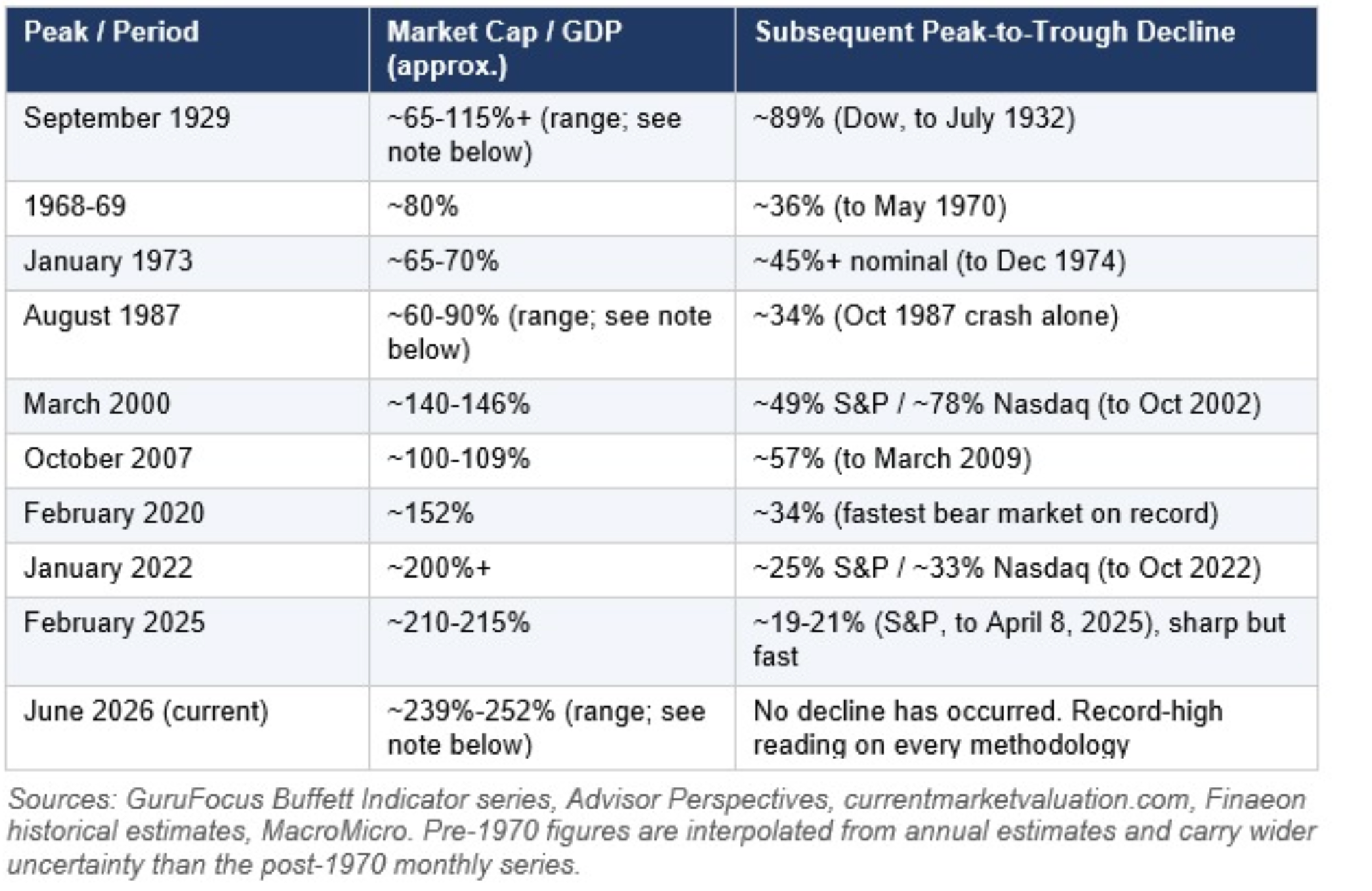
The Buffett Indicator, which measures total U.S. public equity market capitalization divided by GDP, is the simplest lens for comparing equity exposure across eras. The table below places today's reading against prior cyclical peaks.
A note on which number to use
Published estimates of today's ratio range from roughly 239% (Buffett Indicator) depending on exact GDP vintage and market-cap scope. Investor Paul Tudor Jones has separately cited a figure of 252% (per his own analysis, discussed publicly in an April 2026 podcast with Patrick O'Shaughnessy), with his own framing of prior peaks at roughly 65% in 1929, 85-90% in 1987, and 170% in 2000. These figures are somewhat lower than the GuruFocus series used elsewhere in this report, reflecting a different methodology or data source. The spread across all of these reputable sources illustrates that the ratio is sensitive to numerator scope (e.g., whether foreign-domiciled listings or private companies are included) and to which GDP vintage is used, since GDP is revised repeatedly after initial release.
The exact number matters less than the consistent conclusion across every methodology: the current reading is the highest on record, by a meaningful margin, regardless of which credible source is used.
In 1929 and 1987, specifically
The 1929 figure deserves its own caveat. Unlike today, there was no continuously published, broad-based market-cap series in 1929, so any estimate is a reconstruction, and analysts differ meaningfully on the leverage factor and equity universe used to build it. Paul Tudor Jones cites roughly 65%. A commonly used long-run historical series (Global Financial Data-derived) puts it closer to 115%, and academic reconstructions (e.g., McGrattan & Prescott, building up from corporate earnings and P/E ratios) run higher still, in the range of 124-167% of GNP. The gap largely comes down to assumptions about which companies count (NYSE-listed only versus all U.S. corporations), which GNP vintage is used, and how leveraged equity ownership was at the time via margin debt and investment trusts, all of which were far less standardized and far less documented in 1929 than equivalent figures are today.
This is a real, open methodological dispute among economic historians, not a simple error on either side. But it does not change the conclusion that matters here: whichever 1929 estimate one prefers, 65%, 115%, or even the higher academic estimate of roughly 154%, today's reading of roughly 239-252% is dramatically higher than all of them. On the low end of the 1929 range, today's exposure is nearly four times as large relative to the economy; even against the highest academic estimate of 1929 leverage, today's reading is still well over 1.4 times higher. The size of the gap changes depending on which 1929 number is used, but the direction and the basic conclusion do not. Under any reasonable assumption, the U.S. economy is structurally far more exposed to equity markets today than at the eve of the 1929 crash.
The same pattern shows up for 1987. Estimates used in this report put the pre-crash reading around 60-65%; Paul Tudor Jones, drawing on his own analysis, cites roughly 85-90%. As with 1929, there is no single authoritative public series for market cap relative to GDP this far back. Quarterly, broad-index data of the kind GuruFocus and Advisor Perspectives publish today generally only becomes reliable from the 1970s onward, and even then, different providers diverge by single-digit percentage points depending on GDP vintage and index composition. The gap between 60% and 90% likely reflects similar judgment calls: which equity universe is counted, and which GDP figure (and revision) is used as the denominator. Once again, the conclusion is insensitive to which number is correct, because even at the high end of Jones's 1987 estimate, today's reading is roughly 2.4-2.8 times higher; at the low end used elsewhere in this report, it is closer to 3.5-4 times higher. Either way, today's equity exposure relative to the economy dwarfs the level that preceded the most severe one-day crash in modern market history.
It is worth pausing on the most recent entry. The S&P 500 peaked at a closing record on February 19, 2025, then sold off sharply as the new administration's “Liberation Day” tariff announcements escalated in March and early April. The index fell roughly 19-21% intraday by April 7-8, briefly brushing bear-market territory before recovering essentially all of the loss by mid-May, once tariffs were paused and inflation data came in softer than feared. This is a useful data point precisely because of how it differs from the others on the list: a real, sharp double-digit decline driven by a clear, identifiable policy catalyst (rather than a credit event or valuation unwind), that resolved quickly once the catalyst was reversed. It illustrates that policy-driven shocks can be just as sharp as structural ones, and that they can unwind just as fast if the underlying policy shifts or reverts. That speed of reversal is not guaranteed in the scenario this report explores, particularly if an oil shock proves less reversible than a tariff pause.
Two things stand out about the broader historical pattern. First, today's reading, roughly 239% by public index methodologies (and as high as 252% per Paul Tudor Jones's own analysis), is not just a new record under any of these assumptions; even the low end of that range sits well above the prior record of roughly 200%+ set in early 2022, and well above the 2000 dot-com peak that Warren Buffett himself described as “playing with fire” at roughly 140-170% (depending on source). Second, every prior reading above roughly 140% (1929 on the higher estimates, 2000, 2007, 2020, 2022) was followed by a decline of 25% or more.
There is no historical precedent for a reading this elevated resolving painlessly under any of the competing assumptions, though there is also no precedent for a reading this elevated existing in the first place, so the indicator is, in a literal sense, in uncharted territory regardless of which source one trusts.
1.2 A Second Lens: Price/Earnings and the Reversion Math
The Buffett Indicator measures the market against the size of the economy. The price/earnings (P/E) ratio measures it against corporate profits directly, and asks a more practical question: if valuations simply reverted to their historical norm, how far would prices have to fall? As with the Buffett Indicator, the honest answer depends heavily on which P/E series, and which historical average is used. The spread here is unusually wide.
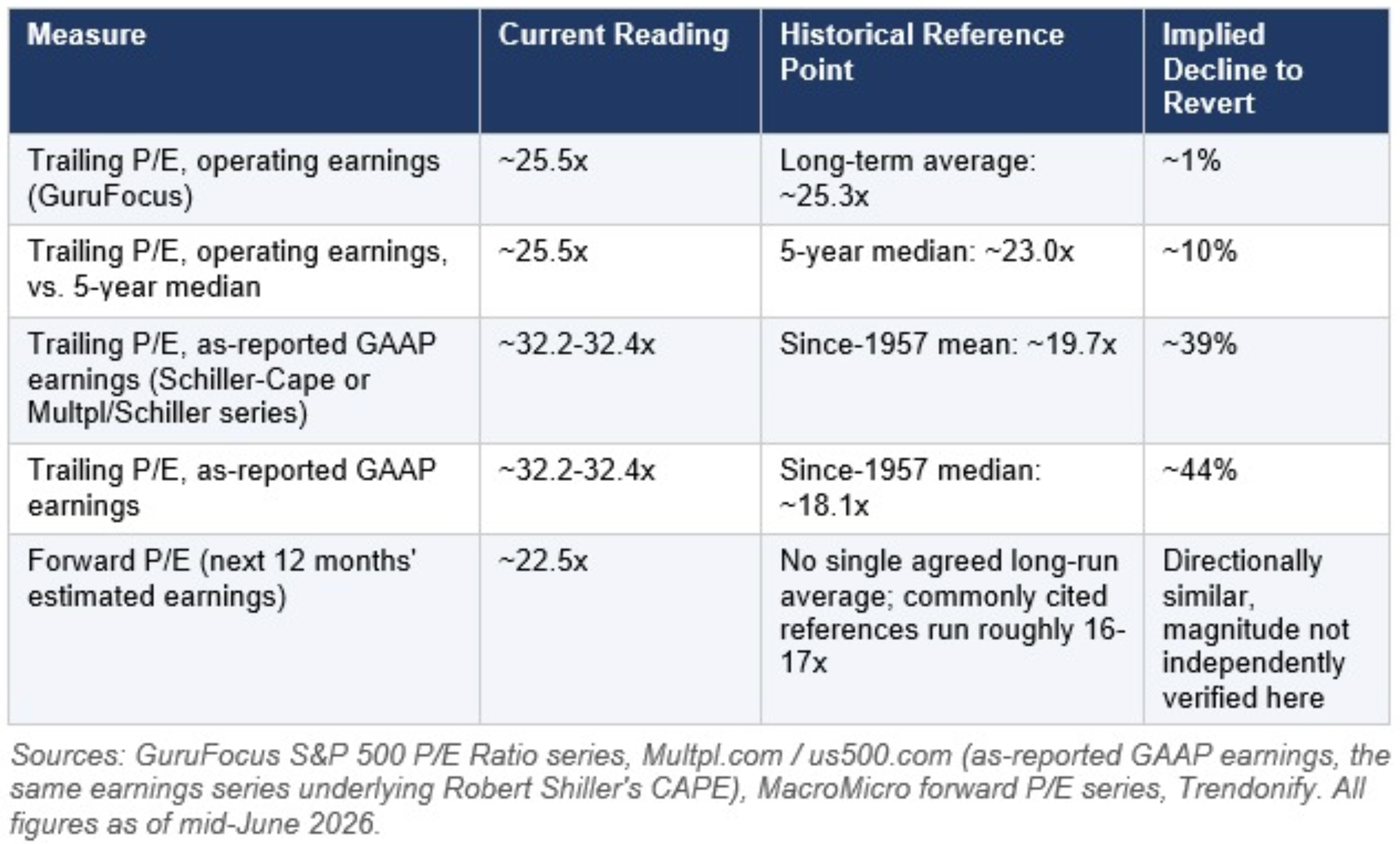
The reason for that gap, roughly 1% versus 44%, comes down almost entirely to which earnings figure sits in the denominator. GuruFocus's operating-earnings-based series strips out one-time charges, write-downs, and non-recurring items, which tends to produce a lower, smoother P/E that happens to sit very close to its own long-term average right now. The Multpl/Shiller series uses as-reported GAAP earnings, which include those one-time items and therefore produce a higher, more volatile P/E, and because that series' own long-run average (going back to 1957) is also much lower, the implied reversion is far larger. Both are legitimate, widely used methodologies; they are simply answering slightly different questions (“what are normalized operating profits worth” versus “what are total realized profits worth”).
Two observations are robust across every version of this calculation. First, every measure shows the market trading above its own historical reference point right now, there is no methodology under which the market screens as cheap or even fairly valued. Second, the size of the implied correction is itself highly sensitive to assumption, in exactly the same way the Buffett Indicator readings were: a forecaster using the GuruFocus operating-earnings series would describe today's valuation as only modestly stretched (a ~1-10% reversion), while a forecaster using the Shiller/GAAP series would describe a reversion of the same broad magnitude this report's equity-decline scenario already explores (~35-44%). Readers should treat any single “the market needs to fall X% to be fair value” headline with the same skepticism applied to any single market-cap-to-GDP reading earlier in this report, the number is a function of the chosen earnings definition and reference period, not a fact independent of methodology.
Section 1.2 Summary
• On the most conservative (operating-earnings, own long-term average) basis, today's P/E implies the market is only modestly above fair value, a low-single-digit-percent overshoot.
• On the most commonly cited historical-comparison basis (GAAP/Shiller-style earnings versus the post-1957 average), today's P/E implies a decline in the high-30s to mid-40s percent range to revert to the historical mean or median, a magnitude broadly consistent with, and in the GAAP case somewhat larger than, the 35% scenario explored in the rest of this report.
• This convergence is notable: two entirely independent valuation frameworks, market cap to GDP and price to earnings on a GAAP basis, both point toward a correction in a similar 35-44% range as the order of magnitude required to restore historically normal valuations, even though they measure completely different things (the market versus the whole economy, and the market versus corporate profits).
The Buffett Indicator captures market size relative to the economy, but three additional structural shifts mean a given percentage equity decline now does more economic damage than the same decline would have in earlier eras:
2.1 Household balance sheets are more equity-weighted
The shift from defined-benefit pensions to defined-contribution retirement accounts (401(k)s, IRAs) over the past four decades means a much larger share of household net worth, and of retirement security specifically, is now directly market-linked than in 1973, 1987, or even 2000. Equities as a share of household financial assets are near record highs. This structurally enlarges the consumption “wealth effect” channel relative to prior cycles.
2.2 Federal revenue is more capital-gains-dependent
Realized capital gains are one of the most volatile components of federal tax revenue, and they are heavily concentrated among the top of the income distribution, whose income increasingly takes the form of stock compensation, carried interest, and realized gains rather than wages. A sharp equity decline does not just reduce household wealth; it mechanically and quickly reduces federal receipts in a way that is far more pronounced than in the bank-and-wage-dominated economy of the mid-20th century.
2.3 Within-Equity Concentration: The Second Layer of Exposure
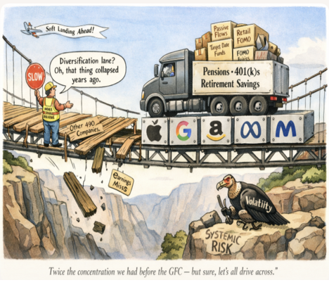
The Buffett Indicator and P/E analysis in the preceding sections treat the equity market as a single aggregate. That framing understates the actual risk, because there is a second layer of concentration operating within equities themselves. The problem is not only that American wealth is unusually concentrated in equities relative to the broader economy. It is also that equity wealth is unusually concentrated within a very small number of companies, which are themselves clustered in a single technology and AI-adjacent sector. These two layers of concentration stack. In a stress event, each amplifies the other.
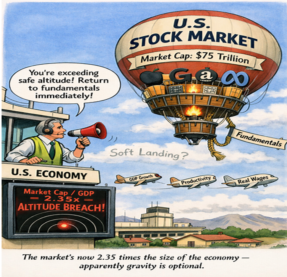
As of June 2026, the ten largest companies in the S&P 500 account for approximately 38% of the index’s total market capitalization. They are, in order of weighting: Nvidia (7.90%), Apple (6.78%), Alphabet (6.03%, combining both share classes), Microsoft (4.37%), Amazon (3.71%), Broadcom (3.02%), Micron Technology (1.98%), Meta Platforms (1.96%), Tesla (1.75%), and Berkshire Hathaway (1.39%). Nine of the ten are technology or AI-adjacent businesses. Berkshire Hathaway is the only company in the top ten with a primary business outside the technology sector. Nvidia alone, at 7.90% of the index, is larger than the entire energy sector and larger than the entire utilities sector. The three largest companies, Nvidia, Apple, and Alphabet, collectively represent roughly 20% of the index’s total value.
The historical comparison makes the current concentration level easier to calibrate. In 1990, the top ten companies, then a mix of industrials, energy, and diversified conglomerates led by IBM, Exxon, and GE, represented roughly 19% of the S&P 500. At the peak of the dot-com bubble in 2000 -- the most concentrated moment in the prior market cycle -- the top ten reached approximately 23% of the index. The figure then declined as the technology selloff redistributed weight to energy and consumer companies. From 2015 forward, technology concentration began rising again, driven by the platform economy and then by the AI investment cycle. The top ten’s weight reached 41% in 2025 before edging down to approximately 38% in the first half of 2026. The current reading is, by a wide margin, the highest concentration level in the history of the index as a broadly diversified benchmark.
The Magnificent Seven, a subset of the top ten (Nvidia, Apple, Alphabet, Microsoft, Amazon, Meta, and Tesla), alone account for roughly 33.8% of the S&P 500 and carry a combined market capitalization of approximately $22.7 trillion as of June 2026. To put that in context: those seven companies are worth more than the entire equity markets of Japan, the United Kingdom, and France combined. The equal-weight version of the S&P 500, which assigns each of the 500 companies an equal allocation rather than weighting by market cap, currently trades at roughly a 30% discount to the cap-weighted index. That discount is the clearest single measure of how much of the cap-weighted index’s apparent value is attributable to a handful of dominant names rather than broad market performance.
There is also a fundamental gap between weight and earnings. The top ten companies represent approximately 38% of index weight but account for only around 32% of S&P 500 earnings. The difference is a valuation premium, a market judgment that these companies will grow earnings faster than the rest of the index over time, driven primarily by expectations about AI monetization and continued platform dominance. That premium is not irrational on its face: these are highly profitable businesses with strong balance sheets and genuine competitive advantages. But it does mean that a meaningful portion of their valuation rests on forward expectations, not current profitability, and forward expectations can reset quickly when macro conditions change. Higher rates compress the multiple on future earnings. Slower growth reduces the earnings trajectory. A shock to AI capital spending, whether from a technological setback, regulatory action, or simple demand disappointment, would hit all nine tech-adjacent top ten companies simultaneously rather than dispersing across sectors.
The practical implication for the 35% decline scenario modeled in this report is this. In a broad market decline of that magnitude from current levels, the top ten companies, which represent 38% of the index, would likely account for a disproportionate share of the absolute dollar wealth destruction, both because of their weight and because of the valuation premium embedded in their prices relative to current earnings. Using the S&P 500’s approximate total market capitalization of $75 trillion, the top ten alone represent roughly $29 trillion in equity value. A 35% decline in those names would destroy approximately $10.1 trillion in wealth from just ten companies. But the transmission channels those companies represent, federal tax receipts from stock compensation and capital gains realizations among technology workers, consumer spending by the wealthiest households with the heaviest tech equity exposure, corporate capital expenditure decisions by companies whose equity is the primary currency for acquisitions, are precisely the channels that the fiscal analysis in Sections 2.5 and 3 identifies as most consequential. The concentration is not just an index-construction curiosity. It is a direct amplifier of the wealth-effect and fiscal-revenue transmission chains this report examines.
2.3A Historical Precedents: When the Market Was This Concentrated Before
In fact, there are no precedents because the market was never this concentrated before.
There were prior periods when market capitalization was comprised of a limited number of companies, but the concentration we have today is by far the greatest in the modern era of broad-based indexing. Prior precedents are instructive in ways that should give pause rather than comfort.
The railroad era (roughly 1840 to 1875) is the most direct structural analog in U.S. history. The ten largest companies represented about 20% of the stock market in 1853, a ratio that held for most years until 1911, with railroad companies like Pennsylvania Railroad and Union Pacific dominating the market and driving economic development. That figure is actually considerably lower than today’s 38%.
Around 1900, concentration was higher still. The largest single company represented 9% of total stock market value, with the top five at 17% and the top ten at 24%. By 1929 that had actually declined significantly: the largest company (AT&T) represented only 3% of the market, the top five 10%, and the top ten 16%. This broadening reflected the expansion of publicly listed companies across many new industries rather than any fundamental reduction in corporate concentration in the economy itself.
The 1920s to the late 1960s was a sustained era of elevated concentration. The weight of the top ten stocks regularly exceeded one-quarter of overall market value throughout those decades. Dominant names of the postwar period, sometimes called the original Magnificent Seven, were AT&T, General Motors, IBM, Standard Oil, General Electric, du Pont, and U.S. Steel. They reflected a genuine cross-section of the American industrial economy: telecommunications, automobiles, computing, energy, heavy manufacturing, chemicals, and steel. The concentration was real, but the underlying sector diversity meant that a shock to any one industry did not automatically hit all seven simultaneously.
The Nifty Fifty era of the early 1970s was concentration of a different character. Rather than ten companies, roughly fifty growth stocks, IBM, Xerox, Polaroid, Kodak, McDonald’s, Coca-Cola, and others, were treated by institutional investors as permanent one-decision holds at any price. These companies commanded price-to-earnings ratios of 50 to 90 times earnings, sustained by the conviction that their growth was so reliable and durable that valuation was irrelevant. When earnings growth disappointed, or interest rates rose, the multiple compression was swift and severe. Many of the Nifty Fifty fell 60 to 80 percent from peak to trough between 1973 and 1974. The lesson the era provides is not that concentrated leadership always fails, but that elevated multiples sustained by narrative, rather than current profitability, are acutely vulnerable to any change in the macro environment.
The dot-com peak of 2000 is the most commonly cited modern comparison, although it was actually less concentrated than today. The top ten weighting hovered between 18% and 23% between 1990 and 2015. It had not breached 20% of market value again until 2020. From that point it accelerated sharply, reaching a record 40.7% in 2025 before settling to approximately 38% in early 2026. In less than a decade, top-ten concentration in the S&P 500 nearly doubled. No prior bull market cycle produced a comparable compression of market value into so few names in so short a time.
The critical distinction from every prior era is sector uniformity. In 1900 the top companies spanned banking, railroads, oil, steel, and tobacco. In the postwar decades they spanned industrials, energy, telecoms, and consumer goods. Even at the dot-com peak, General Electric, Exxon, and Citigroup were mixed in with Microsoft and Cisco. Today, 9 of the top 10 S&P 500 companies are technology or AI-adjacent. A single sector-specific shock, whether from regulatory action, a reset in AI capital spending expectations, or a repricing of growth multiples driven by higher real interest rates, now hits the whole top of the index simultaneously rather than dispersing across industries. This is categorically different from every prior concentration episode in the historical record.
One further parallel is worth noting. The 1920s, like the 2020s, was a period of genuine technological transformation, high wealth inequality, and celebrity businessmen. Margin account balances exceeded $1.2 trillion in December 2025, up 36% from a year earlier, a structural echo of the credit-fueled speculation that characterized the late 1920s. And the historical record after prior concentration peaks is consistent: in the five years following the peak periods of the Nifty Fifty and the dot-com era, the top five companies underperformed the remainder of the S&P 500 considerably. Investors who held an equal-weight portfolio fared materially better than those who held the cap-weighted index in each case. That pattern does not guarantee it repeats. But it has repeated after every comparable episode in the data.
Summary: the current top ten concentration of approximately 38% is higher than the dot-com bubble, higher than any postwar reading, and roughly comparable only to the early 1900s when Standard Oil and U.S. Steel were in their trust-era dominance. The difference is that in 1900 the concentrated companies represented entirely different industries. Today they are almost all the same bet.
2.4 Corporate funding runs through markets, not banks
Relative to the 1970s, a much larger share of corporate financing flows through capital markets (corporate bonds, equity issuance, private credit) rather than traditional bank lending. This means equity and credit market stress now transmits to real economic activity, capex, hiring, refinancing, more directly and more quickly than in a more bank-intermediated system.
2.5 The starting fiscal position is the real differentiator
This is the most important structural difference, and it is not about market structure at all, it is about how much room policymakers have left. The table below compares the fiscal and monetary starting conditions ahead of three major downturns to today.
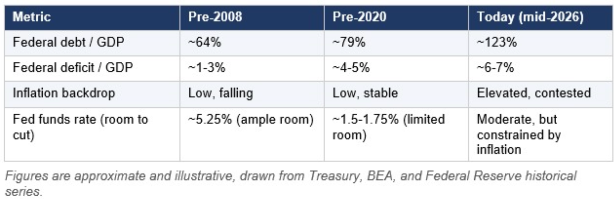
In 2008 and 2020, the Fed and Treasury had room to cut rates to zero and run large deficits without an immediate inflation consequence, because both crises began from a low-inflation, lower-debt starting point. Today's starting point is materially different on every one of these dimensions, which is the crux of the “less cushioned” argument.
3. The Base Scenario: A 35% Equity Decline on Its Own
Using the GuruFocus/Wilshire-based reading of approximately 239%, current total market capitalization is roughly $76 trillion against approximately $32 trillion in GDP; a 35% decline destroys approximately $26 trillion in equity wealth, equivalent to roughly 82% of GDP. Using Paul Tudor Jones's higher 252% figure, the equivalent base would be closer to $80 trillion, and the same 35% decline would destroy roughly $28 trillion, or close to 89% of GDP. Depending on your choice of several credible assumptions, the conclusion is the same: a 35% decline destroys equity wealth equal to somewhere between 82% to 89% of one full year's U.S. economic output, an event with no precedent in scale, even before considering second-round effects.
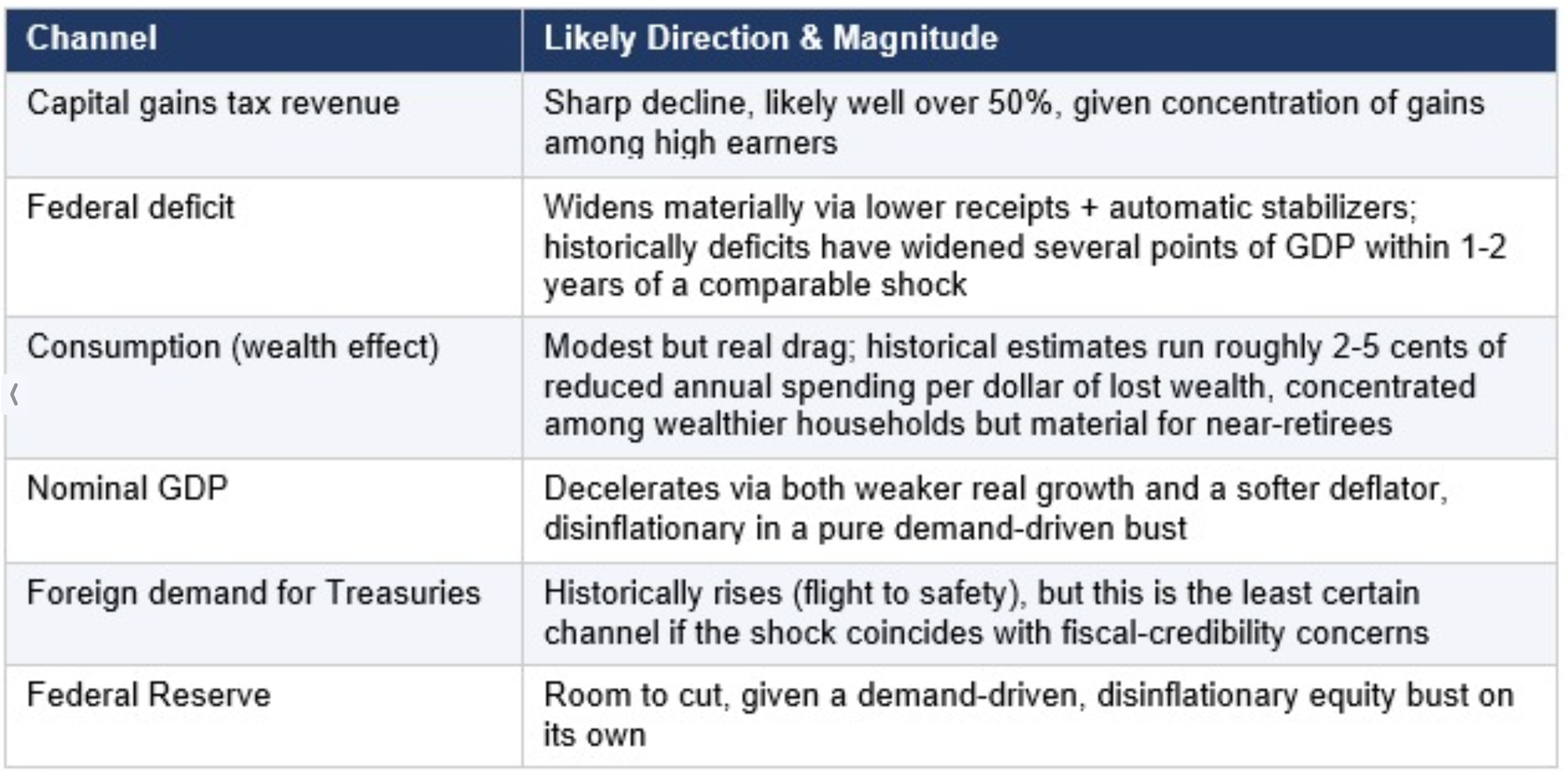
In isolation, this scenario resembles 2008 or 2020 in mechanism, but unfolds against a much weaker starting fiscal position. The deficit and debt/GDP trajectory would likely move into territory not seen outside wartime or the pandemic emergency, without the low-inflation backdrop that made aggressive stimulus consequence-free in those earlier episodes.
Paul Tudor Jones frames the broader backdrop as a “sovereign debt bubble,” arguing that record Treasury issuance, a federal deficit he has cited at roughly $1.9 trillion in 2026, and a near-doubling of foreign ownership of U.S. assets since 2017 leave little room to absorb a shock of this size. His own description of the mechanism: the loss of capital gains revenue, which he estimates at about 10% of total federal tax receipts, “goes to zero,” the deficit “blows up,” and the bond market “gets smoked.” That is, in plainer language, the same revenue-deficit-Treasury transmission chain laid out in the table above.
4. The Iran War: From Hypothetical to Realized Shock
In June 2025, when I first drafted the hypothetical scenario, I modeled a potential Iran oil shock and its ramifications. The scenario I envisioned is exactly what occurred. The economic damage from the oil and shipping disruption is already embedded in the macro baseline. The following chart documents what actually happened, why it changes the scenario framing materially, and what it means for the Federal Reserve’s room to maneuver if equities were to decline from here.
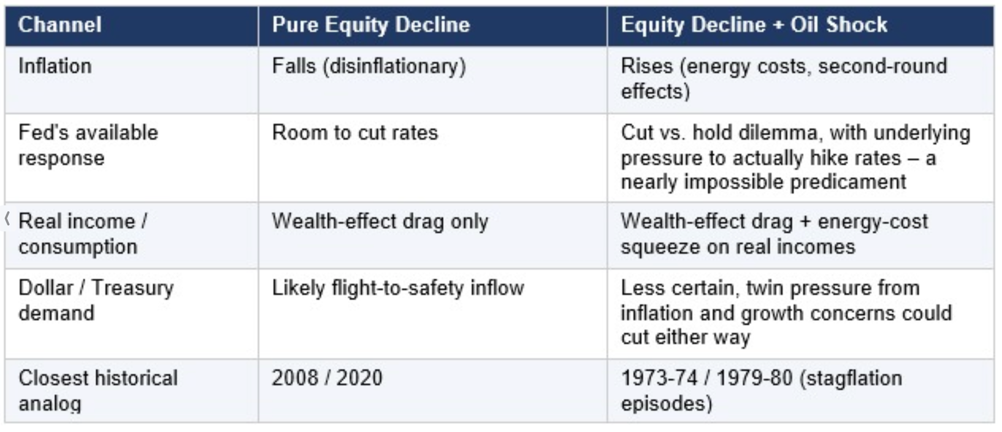
The 1973-74 episode is the closest direct analog available: an equity bear market (the Dow eventually fell more than 45%) coincided with the 1973 oil crisis and the unwinding of Bretton Woods, producing a slowdown from roughly 7% real GDP growth to outright contraction alongside inflation that surged from the mid-single digits into double digits. That combination forced the Fed of that era into a prolonged, painful tightening cycle, even as the real economy weakened -- the textbook stagflation trap.
Applied to today’s setup, the Iran war has already placed the Fed in an analog of the 1970s bind, but starting from a higher debt load and a less settled inflation picture than even the 1970s Fed faced at the onset of that cycle. Whether the Fed prioritizes growth (cutting, risking re-accelerated inflation and de-anchored expectations) or inflation (holding or hiking, deepening the equity-driven downturn and raising default and rollover risk across credit markets) is the central open question, and it is as much a political and credibility question as an economic one. The difference from the pure thought experiment is that this is no longer a hypothetical dilemma: the oil shock has arrived, and the Fed’s room to maneuver has already been consumed to a meaningful degree before any equity decline has even begun.
4.1 What Actually Happened: The Strait of Hormuz and the Oil Price Shock
Iran’s closure of the Strait of Hormuz following Operation Epic Fury was the largest disruption to world energy supply since the 1970s energy crisis, and by several measures, the largest in the recorded history of the global oil market. Pre-conflict, approximately 3,000 vessels transited the Strait each month, carrying roughly 25% of the world’s seaborne oil and 20% of global LNG. They also carried an estimated 30 to 35% of global urea exports and 20 to 30% of ammonia exports. In other words, up to 30% of global fertilizer trade passed through the Strait of Hormuz, a critical component of global farming. By early March 2026, ship-tracking data showed a 95% reduction in crude oil carriers transiting Gulf ports and a 99% reduction in LNG shipments. The consequences for global energy prices were immediate and severe: Brent crude surpassed $100 per barrel on March 8 – the first time in four years – reaching a peak of $126 per barrel before briefly spiking to $166 at the Dubai crude benchmark. March 2026 saw the largest single-month increase in global oil prices ever recorded. The International Energy Agency’s 32 member states unanimously released 400 million barrels from emergency reserves – approximately four days of global consumption – in an attempt to stabilize markets, while the U.S. Treasury temporarily suspended sanctions on Russian oil in transit to India and other buyers, a measure that expired before fully stemming the price surge. By mid-June, a conditional ceasefire is in place and shipping is nominally resuming, but traffic through the Strait remains far below pre-war levels and the market risk premium remains elevated.
4.2 How the Iran War Complicates the Federal Reserve’s Job
The Fed’s primary tool in a demand-driven equity downturn is rate cuts, as deployed aggressively in 2008 and 2020. That tool is now significantly constrained. The oil shock from the Iran war has re-injected supply-side inflation into an economy that was already contending with tariff-driven price pressures and a labor market that had not fully disinflated. Rate reductions that might ordinarily accompany an equity decline would risk re-accelerating consumer price inflation at a moment when the Fed’s credibility on its 2% target is far from restored. The Fed has missed its inflation target by considerable margins for five years in a row. Rate hikes or holds, conversely, would deepen any growth slowdown and expand credit stress across the corporate and sovereign debt markets. This is precisely the stagflation trap -- growth weakening while inflation stays elevated -- that the 1973-74 and 1979-80 episodes demonstrated is the most policy-intractable combination available. The U.S. economy was already struggling with tariff-driven inflation and declining employment growth before the conflict; energy shock from the Iran war has added a second, independent inflation impulse on top of that baseline. Interest rate cuts that market participants had previously anticipated for 2026 have been postponed or taken off the table entirely in light of the energy price surge. The net effect is that the Fed enters any potential equity-market stress event with meaningfully less room to act than it had entering 2025, or than it had entering any of the prior downturns against which this report benchmarks. Moreover, the secondary inflationary shock from rising food prices is likely to hit between six and nine months from now due to the Iran war’s impact on food production.
4.3 How the Iran War Worsens the U.S. Fiscal Position
Fiscal damage from the Iran war compounds an already-critical starting position. Three channels are most significant. First, the military campaign itself, described as the largest U.S. military buildup in the Middle East since the 2003 Iraq invasion, including an extended air war, naval blockade operations, base defense across Qatar, the UAE and Bahrain, and ongoing force projection, carries direct costs that add to a federal deficit already running approximately $1.9 trillion in fiscal year 2026, or roughly 6-7% of GDP. While the U.S. government has been very coy about how much money was spent on these operations, estimates run as high as $100 billion. Plus, critical missile supplies and other strategic arms have been largely depleted. Second, the reconstruction and development commitment embedded in the June 17 ceasefire memorandum, which included an “economic commitment to a reconstruction and development plan for Iran” as part of the terms, adds an open-ended forward spending obligation to an already-stretched balance sheet. Third, the oil price shock itself has secondary fiscal effects: it raises the cost of federal energy purchases, puts upward pressure on government borrowing costs via its inflation pass-through to Treasury yields, and squeezes real household income in ways that feed back into slower growth, lower capital gains realizations, and wider automatic stabilizers. None of these effects is self-limiting in the short run. The war has not freed up fiscal space. It has consumed more of it, on top of the starting conditions described in Section 2.5.
4.4 How the Iran War Removes Flexibility for Large-Scale Spending Programs
One of the underappreciated consequences of the Iran war is that it has pre-spent the political and fiscal capital that would otherwise be available for a large-scale demand-side response to an equity or growth shock. In 2008, the Emergency Economic Stabilization Act (TARP) passed against the backdrop of a financial system in acute crisis, but it passed, in part because the fiscal position was still manageable and in part because there was no competing crisis consuming political attention and budget authority simultaneously. In 2020, the CARES Act, and subsequent stimulus packages totaling several trillion dollars, were deployed against a COVID shock from a lower-debt starting point with a cooperative Fed. The Iran war removes both of those preconditions. With defense spending elevated, reconstruction commitments made, and Treasury borrowing already running at historic peacetime levels, the argument that “we can simply borrow more” in response to a growth shock faces a materially harder political and market reception than it did in either prior episode. Bond markets that might otherwise welcome Treasuries as a safe haven in a domestic equity decline have already absorbed months of elevated war-related issuance. Congressional appetite for a new round of deficit spending, already difficult given current debt levels, is further compressed by the visible cost of the Iran campaign and the ongoing reconstruction obligations. The practical implication is that if equities fall sharply from current levels, the policy toolkit available for a large, fast-moving fiscal response is sparser than it has been at any comparable inflection point in modern U.S. economic history.
4.5 Where Things Stand as of June 22, 2026: The Outcome the U.S. Did Not Expect
The war’s stated objectives and its negotiated outcome are worth placing side by side, because the gap between them has direct fiscal, strategic, and macroeconomic consequences. Operation Epic Fury was authorized with publicly stated goals that included regime change, the permanent dismantlement of Iran’s nuclear and missile programs, and, as President Trump stated explicitly on March 6, “unconditional surrender.” The administration declared on multiple occasions that Iran’s military had been destroyed and that the Strait of Hormuz had been reopened, claims that repeatedly proved premature. The ceasefire memorandum signed June 17 produced a materially different result than the stated objectives would warrant.
Under the terms as publicly reported, the United States agreed to lift the naval blockade of Iranian ports; provide sanctions relief; release frozen Iranian assets; allow Iran back into international banking systems like SWIFT; and commit to a reconstruction and development plan for Iran, a country whose civilian infrastructure sustained significant damage during the very campaign the U.S. initiated. In exchange, Iran agreed to end restrictions on the Strait of Hormuz, reaffirm its stated position that it would not pursue a nuclear weapon, and engage in a 60-day negotiating window on the unresolved nuclear program. Regime change was not achieved; the Islamic Republic remains intact under new leadership. Iran’s nuclear program was damaged but not eliminated, and the 60-day deadline leaves the core proliferation question open. The reconstruction commitment is real money, flowing to a country the United States spent tens of billions attacking four months earlier. The frozen asset release removes a financial leverage tool that cannot be reconstituted, and the value to Iran of reintroduction into world banking systems is immeasurable.
4.6 The Strategic Lesson Iran Has Learned and What It Means for the Macro Baseline
The most consequential output of the 2026 war may not be the immediate fiscal damage but the strategic lesson it has taught with unmistakable clarity: closing the Strait of Hormuz works. Iran did not win the kinetic conflict. Its Supreme Leader was killed, its military degraded, its infrastructure damaged. But it won the negotiation by holding approximately 25% of the world’s seaborne oil supply hostage until the economic cost to the global economy became politically unsustainable for the United States to absorb. Trump admitted to being terrified it would lead to a global depression and stock market collapse, and was recently quoted on ABC News that he feared being “another Herbert Hoover,” the president who served during the early years of the Great Depression. The result of this high-stakes game of chicken was a win for Iran: reconstruction funds, sanctions removal, the release of frozen assets, and the survival of the regime. Every future Iranian government, and every adversary observing the outcome, now operates with empirical proof that Strait closure – or the closure of other strategic chokepoints -- is a viable and effective coercive instrument even against the combined military force of the U.S. and Israel.
The macroeconomic implications are direct and durable. The oil-price risk premium embedded in global energy markets does not return to its pre-war baseline after a negotiated settlement that validates Strait leverage. It rises, because the market must now price a permanently higher probability of future disruption, given the precedent that it works. That elevated risk premium feeds into global inflation expectations, into the cost of oil-dependent manufacturing and logistics, and into the Federal Reserve’s already-constrained ability to cut rates in response to a growth shock, without simultaneously risking an energy-price re-acceleration. The sanctions relief, if honored, restores Iranian oil export capacity to global markets, which provides some near-term supply offset, but at the cost of permanently reducing the financial pressure that had been a primary instrument of U.S. policy for nearly a decade, and which cannot simply be reimposed without triggering the same Strait-closure leverage all over again.
For the fiscal and policy-flexibility picture, the conclusion is straightforward: the U.S. exits this war with a larger deficit, larger forward obligations, less financial and diplomatic leverage over Iran, a global oil market that will for years price in the proven viability of Strait disruption, and the knowledge that the next time Iran is under pressure -- whether from sanctions, regional conflict, or internal instability -- it will confidently reach for the same tool again. That is the strategic and macro context into which any future equity market decline would arrive. The war did not resolve the Iran risk. It clarified the terms on which Iran will continue to exercise its control over the Strait.
5. Foreign Investors, the Dollar, and Treasury Demand
A domestic equity decline alone has historically been dollar-positive: foreign capital flows into Treasuries as a safe haven, pushing yields down even as issuance rises. The Iran war has already tested and complicated this pattern. The war produced simultaneous pressure in multiple directions, with some forces supporting the dollar and some leading to dollar flight. The net result was the “bad” version of the trade-off: periods where stocks, bonds, and the dollar all faced pressure at the same time, suggesting markets were pricing not just equity risk but broader questions about U.S. fiscal credibility and geopolitical reliability. The genuinely open question going forward is whether that pattern holds if an equity decline were to compound the war’s existing damage.
• The historical pattern (2008, 2020): stocks fall, Treasuries rally, dollar strengthens. This is the “exorbitant privilege” working as designed.
• The risk pattern to watch for: stocks, bonds, and the dollar falling together, a signal that markets are repricing U.S. sovereign risk itself, not just seeking shelter from equity risk. This combination is historically rare but is the one genuinely associated with a loss of reserve-currency confidence.
• An oil shock adds a further complication: it can pressure the dollar via the trade balance and inflation expectations even as the equity decline would otherwise support it, pulling the currency in two directions simultaneously.
Foreign holders represent a smaller share of total Treasury debt today than in 2008, with more held domestically and by the Federal Reserve. This reduces the mechanical importance of foreign behavior, but a pullback in foreign demand would still matter disproportionately for market confidence and term-premium pricing, regardless of its quantitative share. Remember, foreigners hold 17% of U.S. equities and tremendous amounts of other dollar-denominated assets. The U.S. can ill afford a widespread hedging or fire-sale of these assets.
6. Synthesis: Is the U.S. More Exposed Than Ever Before?
On the specific claim that the U.S. economy is more exposed to equity-market strength than at any prior point in its history, the evidence in this report points toward agreement, with an important caveat on mechanism:
• Equity market size relative to GDP, roughly 239% by public index methodologies, and as high as 252% per Paul Tudor Jones's own analysis, is at a record high by every credible measure, exceeding every prior peak including 1929, 2000, 2007, 2020, and 2022.
• Within equities, a second layer of concentration amplifies this aggregate exposure. The top ten S&P 500 companies account for approximately 38% of the index, up from 23% at the peak of the dot-com bubble and 19% in 1990. The Magnificent Seven alone represent roughly 30% of the entire index and carry a combined market cap of $22.7 trillion. Nine of the top ten are technology or AI-adjacent businesses, meaning sector-specific risk in AI has become index-level risk for the entire market. The top ten represent 38% of index weight but only about 32% of earnings, a gap sustained by forward expectations about AI monetization. Those expectations are particularly sensitive to the macro conditions an equity-driven downturn would produce: higher effective real rates, slower growth, and compressed capital-expenditure budgets across the technology sector.
• Household wealth, federal revenue, and corporate financing are all more equity-market-linked structurally than in any prior era, deepening the transmission channels from a decline into the real economy.
• The fiscal starting position -- debt/GDP above 120%, deficits already near 7% of GDP, inflation already a live concern -- is markedly weaker than ahead of 2008 or 2020, leaving less room for the kind of aggressive, consequence-free policy response that contained those prior episodes.
• The oil shock scenario this report originally identified as the “genuinely new risk” has now materialized, and its resolution has been worse for the U.S. fiscal and strategic position than a simple cessation of hostilities would have implied. The 2026 Iran war delivered a realized energy price spike, new military spending, forward reconstruction obligations, the release of frozen Iranian assets, and sanctions relief conceded in exchange for a ceasefire that left the regime intact and the nuclear question unresolved. The negotiated outcome has also demonstrated to Iran, and to every adversary observing, that Strait of Hormuz closure is a highly effective coercive instrument that survived a direct military confrontation with the United States. The U.S. enters any equity stress event from this point forward with all of those constraints embedded in the baseline, a permanently elevated geopolitical risk premium in global energy markets, and less financial leverage over Iran than it possessed before the war began.
The caveat: deep, liquid U.S. capital markets and an experienced policy playbook remain real assets that helped contain 2008 and 2020 faster than most observers expected in real time. The difference today is less about market structure or institutional capability, and more about how much fiscal and monetary room is left to deploy that playbook without triggering the inflation or confidence consequences that a lower-debt, lower-inflation economy did not have to worry about. The Iran war has spent down a meaningful portion of that room in advance, and the terms of the exit have made the picture worse than a simple end to hostilities would have. Military costs are embedded in the deficit. Reconstruction obligations are committed. Frozen assets have been released and sanctions relief conceded. The Fed’s rate-cutting flexibility is constrained by an inflation picture that the energy shock has complicated. The political appetite for another round of large-scale emergency fiscal stimulus, already strained by debt levels, has been further compressed by the visible cost of the campaign and its aftermath. And Iran exits the confrontation having demonstrated, to itself and to every future adversary, that holding the Strait of Hormuz hostage works: closing the Strait extracted reconstruction funds, sanctions removal, and regime survival from the world’s dominant military power. That lesson is now priced into the global risk premium permanently. None of this makes an equity-market crisis inevitable. But it does mean that the policy cushion available to absorb one is thinner today than at any comparable starting point in the modern U.S. economic record, and that the compounding-shock scenario this report originally described as a tail risk has, in its core features, already materialized on terms less favorable to the United States than anyone anticipated when the campaign began.
6. Conclusion
While a 35% drop in the stock market is not a foregone conclusion, it is not an unreasonable proposition. In fact, one of my favorite market assessments has been to identify what market moves would inflict the maximum pain on the maximum number of people. It is a remarkably effective exercise to undertake because more often than not…it plays out. It doesn’t necessarily play out quickly (this is why I have always preferred to use option strategies that give me plenty of time for my ideas to play out) but it does happen a surprisingly high percentage of the time.
Yes, this analysis is somewhat cynical, but I feel that such examinations are more important in today’s environment than at any time in the past fifty years.
My next write-up will be relatively short, as I have been asked by a few readers to focus on some simple rules that they might follow for shorter-term trading. I know that a lot of my write-ups have been long-term macro assessments, but I have always been a very active short-term trader. Therefore, I promise to focus on some short-term strategies and advice for my readers. I will also revisit some of my recent trade ideas in the forex markets. The markets have been largely chopping around since my last write-up so we will also have a look at how those markets are behaving.
In the meanwhile, I want to wish you all the very best of luck in these markets.
Andy Krieger
FROM IMRE GAMS:
My Framework
I treat markets as auctions, not prediction machines.
Most sessions on a day-to-day basis are balanced.
Edges form at the extremes of value.
I trade acceptance and rejection at those edges.
If value migrates, I align with it.
If it fails, I trade the rotation.
I am not in the business of forecasting.
I am in the business of validating participation.
_________________________________________________________
Last week, the market wasted no time. A gap straight up into the first upside target zone of 7629 to 7639 set the tone immediately. Sellers were waiting. Price sold off from there back into the control zone of 7423 to 7485.
Buyers responded. The week closed back above the control zone.
Above 7423 to 7485, buyers remain in control. The upside targets stay in play — 7629 to 7639 first, then 7672 to 7694.
Lose the control zone and the downside targets return — 7278 to 7300 first, then 7184 to 7209.
So long as our levels are respected by the market we’ll keep them intact.
The week opened with a gap straight over the 4259 control level, pushing toward last week's first upside target of 4411. It fell short. Buyers couldn't get there.
That was as good as it got for buyers.
Sellers took back control and drove price through the bottom of the control level. The week closed between 4259 and the long-standing downside target of 4107.
That level has featured in this analysis for months. It keeps coming back into focus for a reason.
Heading into next week, 4259 remains the control level. The first upside target is being revised slightly lower to 4406, reflecting where buyers ran out of steam this week. Above there, 4536 to 4586, and beyond that 4722 to 4785.
Below 4107, the final downside target zone of 3958 to 3962 comes into play.
$80 was a level cited in this analysis from the very beginning of the crude oil story. This week it was taken out.
The sell-off was swift and decisive. Price cut through $80 without pause, reaching a low of $73 before buyers stepped in. The market is now trading inside the new control zone of $73.68 to $77.22.
That's a long way from where this market was trading just weeks ago.
The control zone is the line heading into this week. Above it, the first upside target comes in at $79.77 to $81.16, then $83.20 above that.
Below the control zone, $71.54 becomes the next downside target. Lose that and $67.84 comes into focus.
Sellers have been firmly in control of this market for months. The burden is on buyers to hold the control zone and start building a case for recovery.